
Skeleton provides an ever expanding set of elements, components, and utility features. However, you may occasionally may find it valuable to mix and match elements from other UI libraries. This includes open source UI libraries such as Flowbite. In this guide we'll cover how to combine Skeleton and Flowbite to get the best of both worlds!
What is Flowbite?
 Themesberg
Zoltán and the Flowbite team have created an extensive open-source library that includes over 450+ UI elements (called components). By pairing these with Skeleton you open the door to a tremendous number of valuable UI assets.
Flowbite vs Flowbite Svelte
Before we get started, you should know the difference between Flowbite's two offerings. Flowbite is the core library of elements generated with HTML and Tailwind's utility classes, while Flowbite Svelte is a Svelte-focused component library built using these Flowbite elements. The latter is comparable to Skeleton. Unfortunately Flowbite Svelte and Skeleton's Tailwind plugins appear to modify similar settings and currently do not play well together. For this guide, we will be focusing purely on the core library elements.
Create a New Skeleton Project
To begin, we'll create a new Skeleton project using Skeleton CLI:
npm create skeleton-app@latest skeleton-plus-flowbite
- Choose "Yes, using Typescript syntax"
- Select "No" for ESLint, Prettier, Playwright, Vitest, Inspector
- Hit "Enter" to skip Tailwind plugins
- Select the default "Skeleton" theme
- Select the "Bare Bones" template
cd skeleton-plus-flowbite
npm install
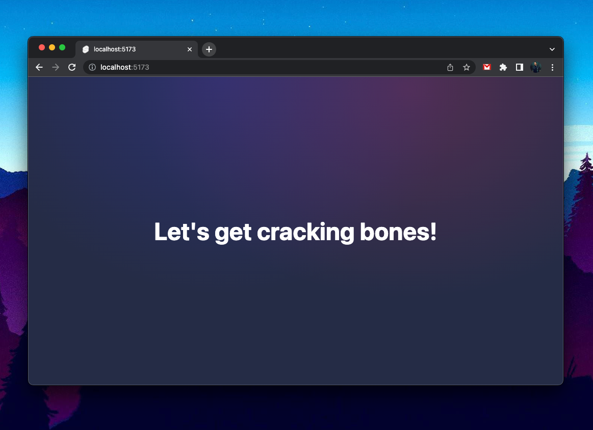
npm run dev -- --openOpen the project in your text editor of choice and ensure your local dev server is running. You'll be met with some basic styles and welcome message:
Supporting Dark Mode
Flowbite provides great support for both light and dark mode styles for most elements. To easily toggle Tailwind's dark mode we'll use Skeleton's Light Switch utility.
Import the component into /src/routes/+page.svelte, then add it to your homepage route template. Feel free to replace all content within this page.
<script lang="ts">
    import { LightSwitch } from '@skeletonlabs/skeleton';
</script>

Flowbite's Timeline Element
You can browse the full list of the available elements (called components) on Flowbite's website. For this guide we'll focus on the Vertical Timeline element. A useful feature not currently available in Skeleton.
Themesberg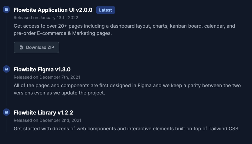
Additionally we'll implement this feature using custom Svelte components. This will encourage reusability and reduce the number of changes needed within the HTML template.
Getting Started
View the component, copy the HTML markup, then create a new component in your project in /src/lib/Timeline/Timeline.svelte. When ready, paste the markup into this new component file.
Next, let's place the new component on our homepage. Open /src/routes/+page.svelte, import the component in your Script tag, then append the component at the very bottom of the file, below the Light Switch.
import Timeline from '$lib/Timeline/Timeline.svelte';<!-- (Light Switch here) --->
<div class="p-10">
<Timeline />
</div>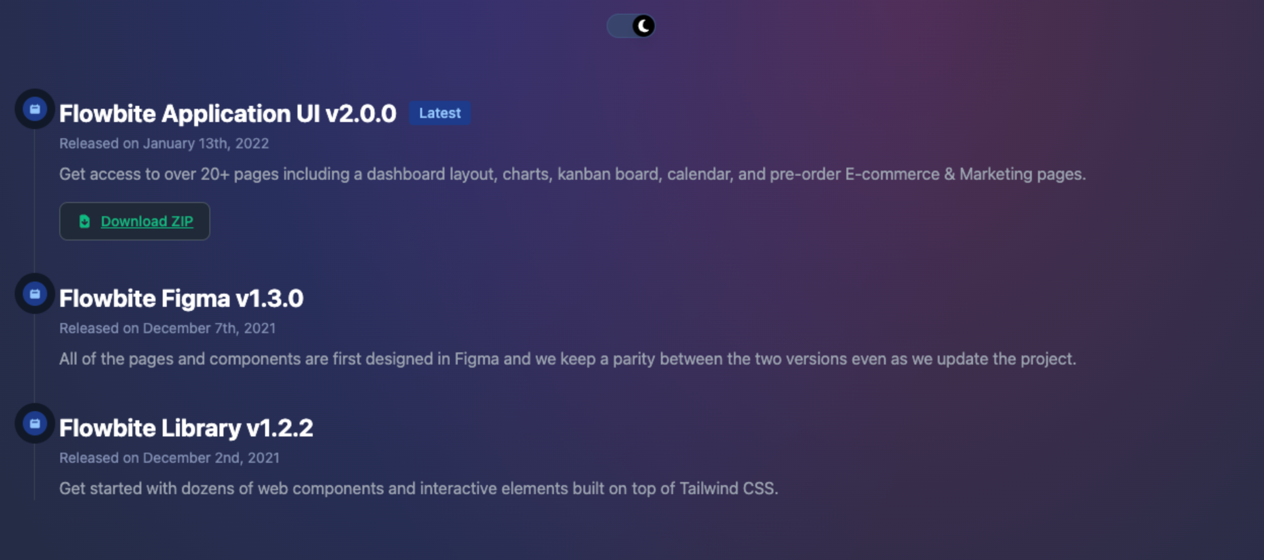
As with our Tailwind UI banner, there's a few changes we'll want to implement:
- Currently the contents of the three timeline points are hardcoded into our component, making it hard to add or remove additional timeline points.
- Many colors are hardcoded and do not change according to the Skeleton theme.
- We'll want to replace the button and badges with Skeleton equivalents.
- We'll make minor adjustments to the layout and typography.
Unlike Tailwind UI, Flowbite's timeline elements do respond to Tailwind's light/dark mode. However, some of the default styles might be hard to see in light mode, so we'll cover this as we go.
Dividing Parent and Child Components
If we review our component markup we'll see it's made up of a wrapping ordered list ol that contains a set of list items li.
To start, let's simplify things by removing the second and third timeline points, the list items li and their contents. This will leave the most fleshed out option at the top:
Next, let's divide our component into two parts, the parent and child elements.
Child Component (TimelineItem.svelte)
Create a new Svelte component in /src/lib/TimelineItem.svelte. Cut the full markup of the the current list item li and it's contents, then paste this into the new component file you just created.
<ol class="...">
    <!-- Let's move this to it's own component --->
    <li class="...">...</li>
</ol>
Parent Component (Timeline.svelte)
Return to our parent Timeline.svelte and implement a default Svelte slot between the open and close of the ol tags, where the li elements resided:
<ol class="relative border-l border-gray-200 dark:border-gray-700">
    <!-- add the following -->
    <slot />
</ol>
We'll also quickly modify the ol border color to match our theme:
<!-- Before -->
<ol class="relative border-l border-gray-200 dark:border-gray-700">

<!-- After -->
<ol class="relative border-l border-surface-400-500-token">TimelineItem Props & Slots
Open TimelineItem.svelte again and let's abstract a few things to Svelte props and slots. For brevity, we've handled this for you. Replace the entire contents of TimelineItem.svelte with the following:
<script lang="ts">
export let title: string = '(Title)';
export let timestamp: string = '(Timestamp)';
export let description: string = '(Description)';
export let badgeText: string = '(Badge)';
</script>
<li class="mb-10 ml-6">
<!-- Slot: Icon -->
<span
class="absolute flex items-center justify-center w-6 h-6 bg-blue-100 rounded-full -left-3 ring-8 ring-white dark:ring-gray-900 dark:bg-blue-900"
>
<slot name="icon">♥</slot>
</span>
<h3 class="flex items-center mb-1 text-lg font-semibold text-gray-900 dark:text-white">
{title}
{#if badgeText}
<span class="bg-blue-100 text-blue-800 text-sm font-medium mr-2 px-2.5 py-0.5 rounded dark:bg-blue-900 dark:text-blue-300 ml-3">
{badgeText}
</span>
{/if}
</h3>
<time class="block mb-2 text-sm font-normal leading-none text-gray-400 dark:text-gray-500">Released on {timestamp}</time>
<p class="mb-4 text-base font-normal text-gray-500 dark:text-gray-400">
{description}
</p>
<!-- Slot: Default -->
{#if $$slots.default}<div><slot /></div>{/if}
</li>
Implement Multiple Children
We can now implement multiple instances of our TimelineItem component on our homepage with unique values. Import the component and add the following to your /src/routes/+page.svelte homepage route:
import TimelineItem from '$lib/Timeline/TimelineItem.svelte';<Timeline>
<TimelineItem
title="Title 1"
timestamp="January 1st, 2023"
description="Lorem ipsum, dolor sit amet consectetur adipisicing elit. Quasi tempore amet, necessitatibus eaque, dolorum praesentium nam."
badgeText="Latest"
>
<button class="btn variant-ghost">Download ZIP</button>
</TimelineItem>
<TimelineItem
title="Title 2"
timestamp="December 1st, 2022"
description="Lorem ipsum, dolor sit amet consectetur adipisicing elit. Quasi tempore amet, necessitatibus eaque, dolorum praesentium nam."
/>
<TimelineItem
title="Title 3"
timestamp="November 1st, 2022"
description="Lorem ipsum, dolor sit amet consectetur adipisicing elit. Quasi tempore amet, necessitatibus eaque, dolorum praesentium nam."
/>
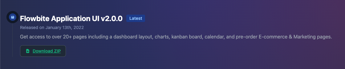
</Timeline>badgeText and added a new Skeleton button in the first item.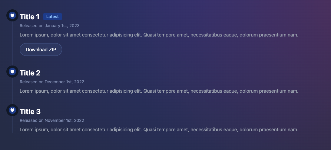
Badge and Icons
While this is starting to look much better, we should take a moment to implement a Skeleton badge, and ensure our icons utilize our theme colors. Open TimelineItem.svelte and make the following changes:
Badge Styles:
<!-- Before -->
<span class="bg-blue-100 text-blue-800 text-sm font-medium mr-2 px-2.5 py-0.5 rounded dark:bg-blue-900 dark:text-blue-300 ml-3">{badgeText}</span>

<!-- After -->
<span class="badge variant-soft-primary">{badgeText}</span>Icon Styles:
<!-- Before -->
<span class="absolute flex items-center justify-center w-6 h-6 bg-blue-100 rounded-full -left-3 ring-8 ring-white dark:ring-gray-900 dark:bg-blue-900">...</span>

<!-- After -->
<span class="absolute flex items-center justify-center w-6 h-6 variant-filled-primary rounded-full -left-3 ring-8 ring-surface-200-700-token">...</span>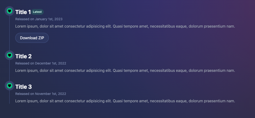
We can quickly resolve that spacing issue between the icon and title by adjusting the li classes in TimelineItem.svelte.
<!-- Before -->
<li class="mb-10 ml-6">

<!-- After -->
<li class="mb-10 ml-10">
Adjust Typography
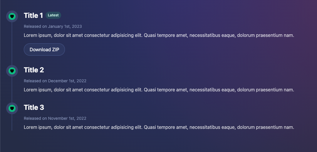
In most cases you can rely on Skeleton's default typography settings, which means we can strip many of Flowbite's inline styles. Let's adjust a few settings now.
Adjust the markup and classes for your title region, noting the addition of the span element around the title.
<h3 class="flex items-center mb-1 space-x-2 -translate-y-2">
    <span>{title}</span>
    {#if badgeText}
        <span class="badge variant-soft-primary">{badgeText}</span>
    {/if}
</h3>span around the title.Adjust the time element for our timestamp:
<time class="block mb-2">Released on {timestamp}</time>Then finally the paragraph element styles:
<p class="mb-4 opacity-75">{description}</p>The final results are shown with all changes is shown below.
Testing Themes
To ensure our new element is fully prepared to utilize any Skeleton theme, let's try our a few of the present options available to us.
Open your tailwind.config.[ts|js] in the root of your project, and register one or more of the following preset themes as follows:
plugins: [
	skeleton({
		themes: { preset: [ "skeleton", "wintry", "modern" ] }
	})
]
Choose from any of the following options:
skeletonwintrymodernrocketseafoamvintagesaharahamlindigogold-nouveaucrimson
Next, open /src/app.html and set the active theme using the data-theme attribute.
<body data-theme="skeleton">
Your new timeline component should respect all theme colors and operate in both light and dark mode as expected.
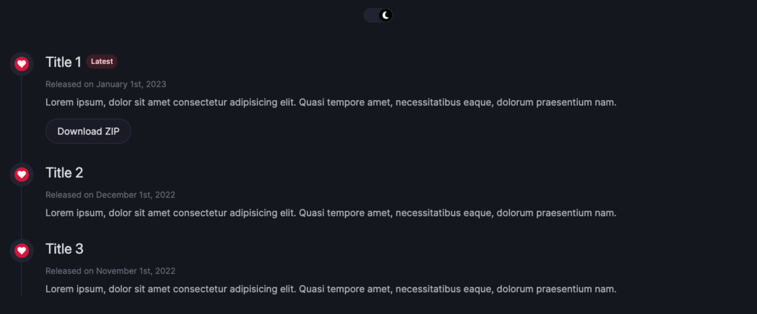
theme-crimson.css theme in dark mode.Additional Resources
While Tailwind UI and Flowbite provide excellent options for extending your UI feature set, we've linked to some other useful resources below:
- https://tailwindcomponents.com/
- https://tailblocks.cc/
- https://merakiui.com/
- https://www.material-tailwind.com/
Project Source Code
Find the source code for this project on Github:
 skeletonlabs