Svelte Simple Datatables
The following guide will cover the basics of integrating Skeleton and Svelte Simple Datatables.
Svelte Simple Datatables is a headless library for creating datatable components with Svelte. It provides a simple API to dynamically interact with iterable data on the client-side, allowing you to filter, paginate, sort, and select data. It can handle server-side data processing, supports Typescript, and has no other required dependencies.
Introduction
Skeleton provides a simple Table Component for implementing tabular data for
presentational purposes. However, this lacks more powerful features, such as search, sort, and filter. This is where Svelte Simple
Datatables comes in. To integrate this, we'll opt for Skeleton's
Table Elements, which provided themed styles to native HTML tables. The end result will
be a new <Datatable /> component, which you may use directly in your own application.
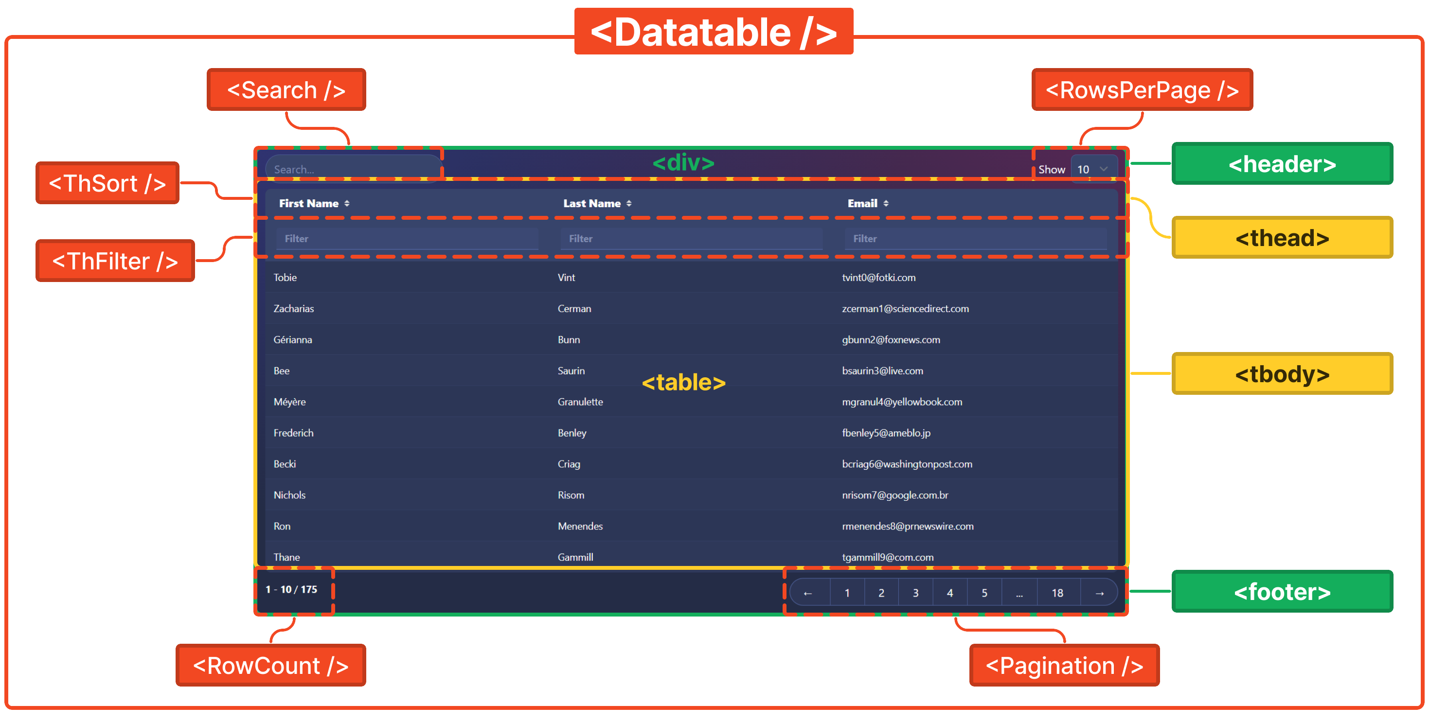
Additionally, we'll also create a number of accessory components to handle search, filter, sort, and pagination features. These smaller components will help augment and extend the overall datatable component.
Starter Template
If you're looking for a quick start or reference project, please refer to our opinionated template on GitHub.
Getting Started
Install Dependencies
Add Svelte Simple Datables to your Skeleton project by running the following command.
npm i @vincjo/datatablesProject Structure
Next, let's plan out our overall project structure.
src
├── lib
|	├── data
|	|	└── data.ts / api.ts
|	└── components
|	    ├── Pagination.svelte
|	    ├── Search.svelte
|	    ├── RowCount.svelte
|	    ├── RowsPerPage.svelte
|	    ├── ThFilter.svelte
|	    └── ThSort.svelte
└── routes
	├── Datatable.svelte
└── +page.svelte/lib/data- Create
data.tsif you are loading data from the client orapi.tsif your data is coming from the server. This will be explained further on, but for now just create the blank Typescript file. /lib/components- All of the files in this directory will be used for accessory components.
/routes/Datatable.svelte- This file will contain the
<Datatable />component, the associated logic, and render the accessory components. /routes/+page.svelte- This is where we'll render and access the
<Datatable />component in this example.
Creating the Components
Each component will need to be configured based on the scope. Select your preference below.
1. Loading Data
To begin, let's add fake dataset in /src/lib/static/data.ts. View a full reference
under the data tab.
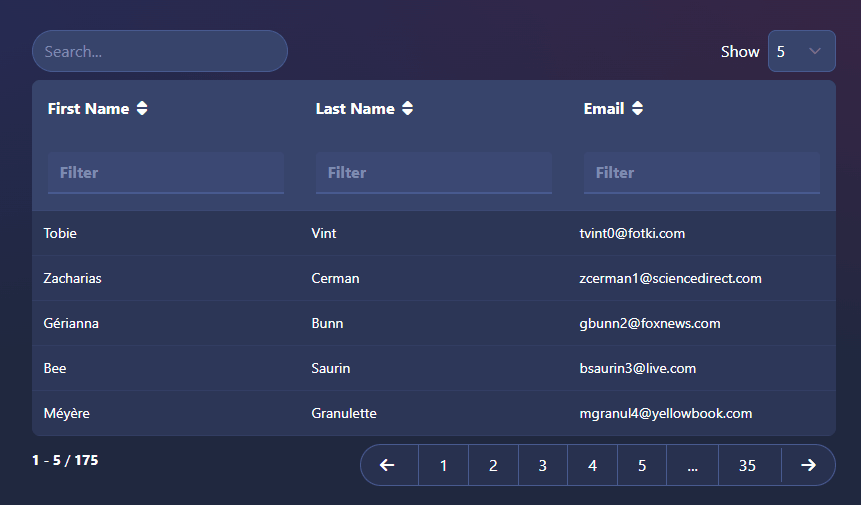
export default [
    { id: 1, first_name: 'Tobie', last_name: 'Vint', email: 'tvint0@fotki.com' },
    { id: 2, first_name: 'Zacharias', last_name: 'Cerman', email: 'zcerman1@sciencedirect.com' },
    { id: 3, first_name: 'Gérianna', last_name: 'Bunn', email: 'gbunn2@foxnews.com' },
    { id: 4, first_name: 'Bee', last_name: 'Saurin', email: 'bsaurin3@live.com' },
    { id: 5, first_name: 'Méyère', last_name: 'Granulette', email: 'mgranul4@yellowbook.com' }
    // ...
];
2. The Datatable Component
Create the new Datatable component in /src/lib/components/Datatable.svelte, import your custom dataset, as
well as the
DataHandler from Svelte Simple Datatables. Then, intialize the handler and
rows.
import { DataHandler } from '@vincjo/datatables';
import data from '$lib/static/data';

const handler = new DataHandler(data, { rowsPerPage: 5 });
const rows = handler.getRows();
Take care to configure your the markup to match the dataset.
<div class="table-container space-y-4">
    <table class="table table-hover table-compact table-auto w-full">
        <thead>
            <tr>
                <td>First name</td>
                <td>Last name</td>
                <td>Email</td>
            </tr>
        </thead>
        <tbody>
            {#each $rows as row}
                <tr>
                    <td>{row.first_name}</td>
                    <td>{row.last_name}</td>
                    <td>{row.email}</td>
                </tr>
            {/each}
        </tbody>
    </table>
</div>
3. Accessory Components
Let's create, import, and add our new accessory components. Note that these will not yet be functional.
import Search from '$lib/components/Search.svelte';
import ThFilter from '$lib/components/ThFilter.svelte';
import ThSort from '$lib/components/ThSort.svelte';
import RowCount from '$lib/components/RowCount.svelte';
import RowsPerPage from '$lib/components/RowsPerPage.svelte';
import Pagination from '$lib/components/Pagination.svelte';<div class=" overflow-x-auto space-y-2">
<header class="flex justify-between gap-4">
<!-- <Search {handler} /> -->
<!-- <RowsPerPage {handler} /> -->
</header>
<table class="table table-hover table-compact table-auto w-full ">
<thead>
<tr>
<!-- <ThSort {handler} orderBy="first_name">First name</ThSort>
<ThSort {handler} orderBy="last_name">Last name</ThSort>
<ThSort {handler} orderBy="email">Email</ThSort> -->
</tr>
<tr>
<!-- <ThFilter {handler} filterBy="first_name" />
<ThFilter {handler} filterBy="last_name" />
<ThFilter {handler} filterBy="email" /> -->
</tr>
</thead>
<tbody>
{#each $rows as row}
<tr>
<td>{row.first_name}</td>
<td>{row.last_name}</td>
<td>{row.email}</td>
</tr>
{/each}
</tbody>
</table>
<footer class="flex justify-between">
<!-- <RowCount {handler} /> -->
<!-- <Pagination {handler} /> -->
</footer>
</div>For brevity, find the full source code for <Datatable /> and all accessory components on GitHub.
4. Import Datatable Component
With our Datatable component now complete, let's import and add it to our +page.svelte.
import Datatable from '$lib/components/Datatable.svelte';<Datatable />Responsive Design
To ensure our datatables are visible on all screen sizes, make sure to utilize Tailwind's responsive design best practices. You can also utilize the Tailwind Element .table-container class, which should be applied to a wrapping element.
Attribution
This guide has been provided courtesy of Kyle Malloy, username
@spacecup on Skeleton's Discord server.