Skeleton provides an ever expanding set of elements, components, and utility features. However, you may occasionally may find it valuable to mix and match elements from other UI libraries. This includes Tailwind UI, an extensive set of elements created by the makers of Tailwind CSS. In this guide we'll cover how to combine Skeleton and Tailwind UI to get the best of both worlds!
Create a New Skeleton Project
To begin, we'll create a new Skeleton project using the Skeleton CLI:
npm create skeleton-app@latest skeleton-plus-tailwindui
- Choose "Yes, using Typescript syntax"
- Select "No" for ESLint, Prettier, Playwright, Vitest, Inspector
- Hit "Enter" to skip Tailwind plugins
- Select the default "Skeleton" theme
- Select the "Bare Bones" template
cd skeleton-plus-tailwindui
npm install
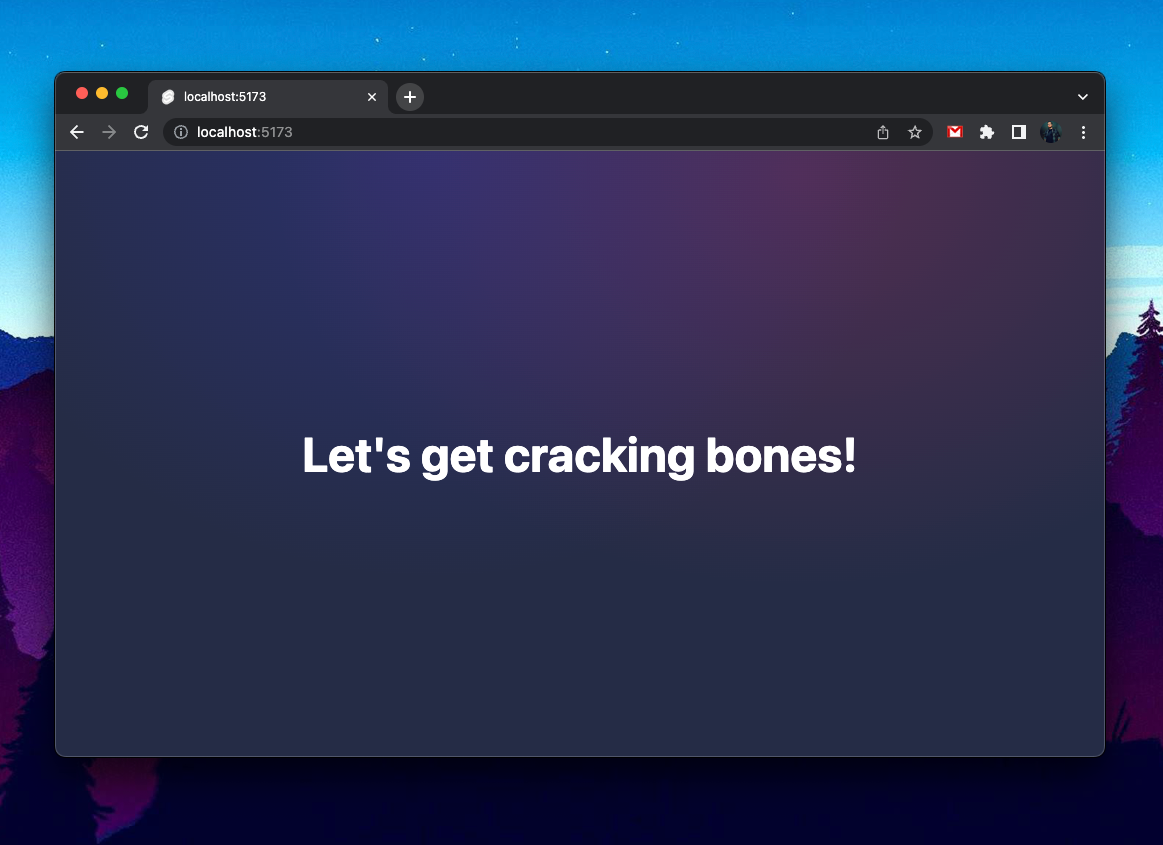
npm run dev -- --openOpen the project in your text editor of choice and ensure your local dev server is running. You'll be met with some basic styles and welcome message:
What is Tailwind UI?

Tailwind UI is an obvious choice for new UI features, as it's built and maintained by the creators of Tailwind CSS. They offer many different elements (called Components). While Tailwind charges for most of this content, they do offer a handful of freebies.
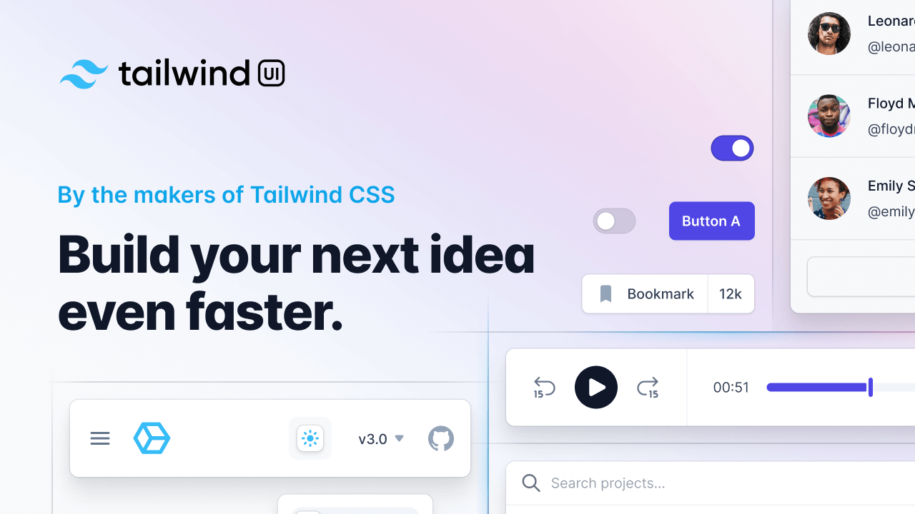
For this guide we'll begin using the "Header banner" sample found on the Tailwind UI Banner section as shown below.
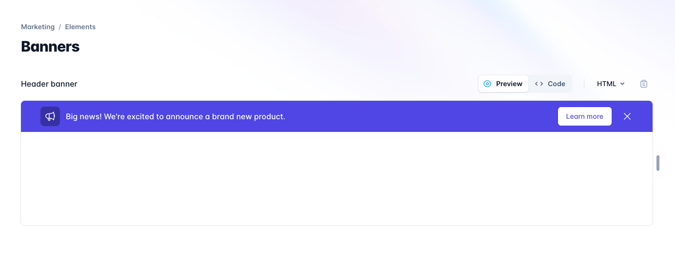
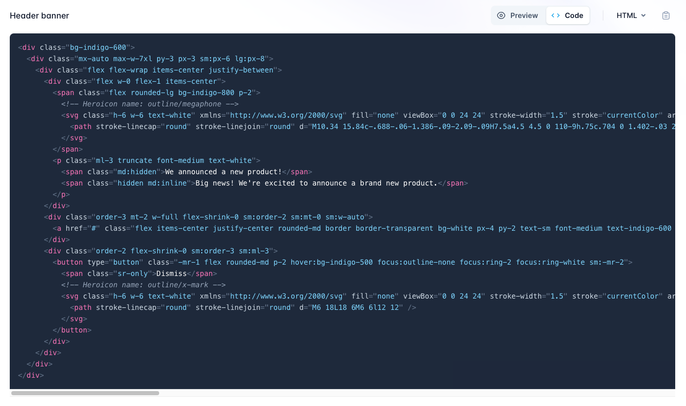
Copy the HTML markup for this element, then paste this into your homepage template in /src/routes/+page.svelte. Feel free to replace all current content.
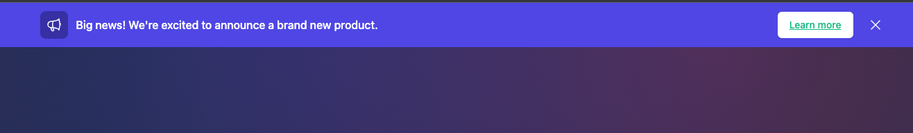
While this looks great by default, there's a few items we'll need to address:
- It's hardcoded to Tailwind's Indigo color, rather than using your theme.
- Theme settings such as border radius are not currently utilized.
- Button styles are hardcoded inline, with minor style issues.
- The text color may not always adhere to accessible color ratios.
- The element is not responsive to light/dark mode by default.
Theme Color
We'll begin by fixing the theme colors. Most text editors include a multi-select feature - for VS Code select the first reference to indigo in line 1 (part of bg-indigo-500) then use control/command+shift+L to select all other instances within the markup. Then type warning to update these values to your theme color. When you save, you'll see the banner is now a golden yellow.
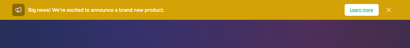
Skeleton supports all color values from 50-900, so even the darkened shade behind the megaphone icon will update as expected.
Using Design Tokens
The element surrounding the megaphone icon is rounded, however, depending on your theme this may not match your theme's --theme-rounded-base setting. Thankfully Skeleton provides a set of Design Token classes that can help.
Locate the span that surrounds the megaphone icon, then update it to use the .rounded-token design token class:
<!-- Before -->
<span class="flex rounded-lg bg-warning-800 p-2">

<!-- After -->
<span class="flex rounded-container-token bg-warning-800 p-2">
This change is very subtle, but will be more prominent on other themes:

.rounded-container-tokenTo ensure this is working, you can open your root layout in /src/routes/+layout.svelte. Then change the theme from theme-skeleton.css to theme-rocket.css or theme-modern.css and save. The border radius setting for these themes should be much more obvious.
NOTE: Be sure to revert back to theme-skeleton.css when done!Skeleton Button Element
By default, Tailwind UI generates their own UI button styles using utility classes inline. This is great, but you may find it easier to maintain using Skeleton's flexible Button element styles.
Within your banner markup, look for the button using an Anchor tag and containing the text "Learn more".
<a href="/" class="flex items-center justify-center rounded-md border border-transparent bg-white px-4 py-2 text-sm font-medium text-warning-600 shadow-sm hover:bg-warning-50">Learn more</a>Then replace it with a Skeleton's button, using the variant filled style:
<a href="/" class="btn variant-filled">Learn more</a>
Color Contrast and Accessibility
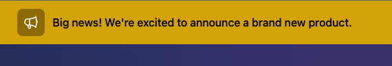
By default the text color for the banner text is hardcoded as white text. This is fine for the indigo background, but may be hard to see on the new yellow background.
Look for the paragraph tag containing the text "Big News!", then change the class from text-white to Skeleton's text-on-warning-token design token.
--on-warning color from your Skeleton theme.Additionally we may wish to apply a similar change to the SVG "X" close icon on the right. Change the SVG class from text-white to text-on-warning-token.
Supporting Dark Mode
Tailwind UI elements only implement base (read: light mode) styles. To easily toggle Tailwind's dark mode we'll use Skeleton's Light Switch utility.
Import the component into /src/routes/+page.svelte, then add it to your homepage route template:
<script lang="ts">
    import { LightSwitch } from '@skeletonlabs/skeleton';
</script>
<div class="p-4 text-center">
    <LightSwitch />
</div>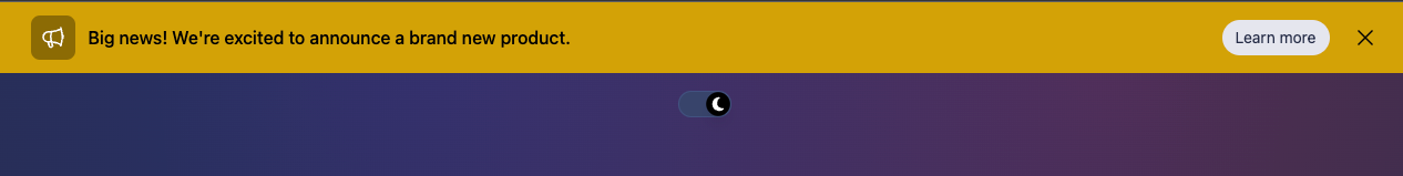
The app background and Skeleton buttons will automatically respond as we toggle between modes. Use Tailwind's dark: modifier to adjust other classes as desired. For example, we can change the primary background in the opening div element like so:
<div class="bg-warning-400 dark:bg-warning-500">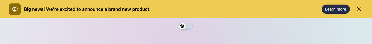
Testing Themes
To ensure our new element is fully prepared to utilize any Skeleton theme, let's try our a few of the preset options available to us.
Open your tailwind.config.[ts|js] in the root of your project, and register one or more of the following preset themes as follows:
plugins: [
	skeleton({
		themes: { preset: [ "skeleton", "wintry", "modern" ] }
	})
]
Choose from any of the following options:
skeletonwintrymodernrocketseafoamvintagesaharahamlindigogold-nouveaucrimson
Next, open /src/app.html and set the active theme using the data-theme attribute.
<body data-theme="skeleton">
Your new banner should respect all theme colors and operate in both light and dark mode as expected.
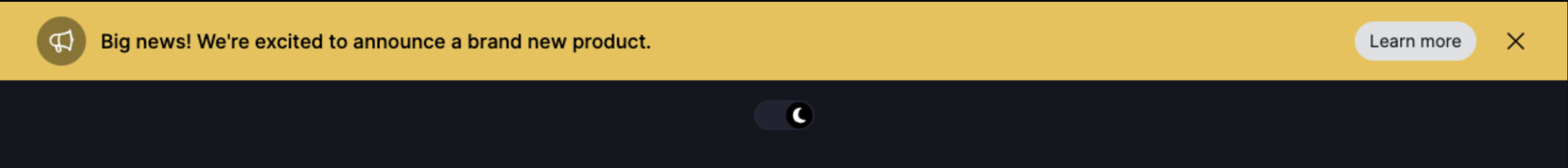
theme-crimson.css theme in dark mode.Additional Resources
While Tailwind UI and Flowbite provide excellent options for extending your UI feature set, we've linked to some other useful resources below:
- https://tailwindcomponents.com/
- https://tailblocks.cc/
- https://merakiui.com/
- https://www.material-tailwind.com/
Project Source Code
Find the source code for this project on Github:
 skeletonlabs